When the Bottle Sells Me Before the Scent Does
I would love to claim that perfume is entirely about smell.
It sounds sophisticated. Serious, even. Very I judge the juice, not the packaging.
Unfortunately, I have eyes. And perfume bottle design gets there before the fragrance does.
And sometimes the bottle has already opened the cart before the atomizer gets a chance.
That doesn’t mean I will buy a fragrance I dislike just because it comes in beautiful glass. I won’t. But pretending the object has nothing to do with the experience feels equally dishonest.
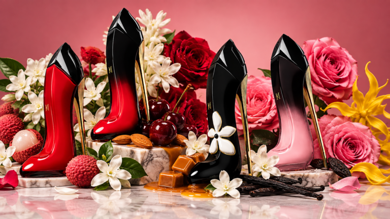
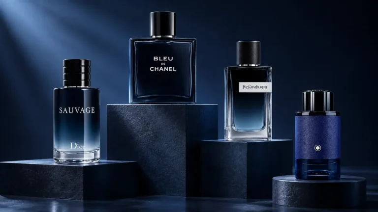
Perfume is one of the few things we buy to experience something invisible, yet it arrives inside an object designed to be looked at, touched, photographed, displayed and remembered.
So yes, perfume bottle design matters to me. Sometimes quite a lot.
Sometimes quite a lot.
This is Not a List of My Favorite Perfume Bottles
Before this accidentally becomes a ranking, it isn’t one.
I could name dozens of bottles I love, and then remember another twenty five minutes later because perfume collections are apparently where organization goes to die.
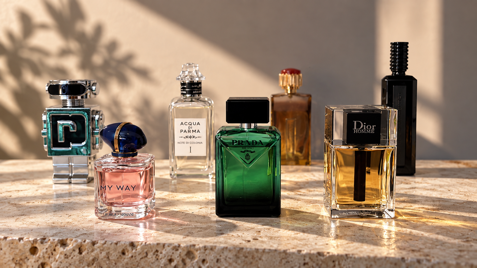
The bottles here are simply a few examples of the very different ways packaging can get my attention.
Some because they are minimal. Some because of the glass itself. Some because they are gloriously decorative.
And one because I like the fragrance much more than the bottle.
Balance.
When Restraint is Enough
I have always loved the bottles from Van Cleef & Arpels’ Collection Extraordinaire.
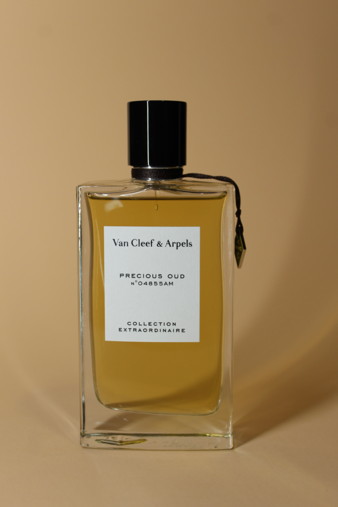
There is very little going on, which is exactly why they work.
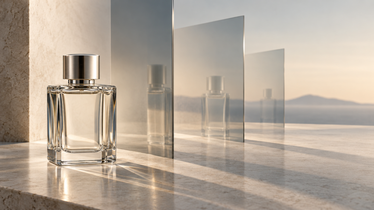
Clear glass. A simple rectangular label. A black cap. Clean proportions.
Nothing is screaming for attention, yet the bottle still feels luxurious.
There is a kind of confidence in that restraint. It doesn’t need an elaborate sculptural concept or a cap large enough to require planning permission.
It just looks expensive, elegant and resolved.
Essential Parfums does something similar in a more contemporary way.

The bottles are almost aggressively straightforward: rectangular glass, simple typography, black cap.
And somehow they are incredibly photogenic.
That matters to me too.
Some bottles only come alive in campaign photography. Others somehow look good sitting on a random shelf in bad afternoon light while surrounded by three samples you forgot to put away.
Essential Parfums belongs to the second category.
Minimal doesn’t have to mean forgettable.
Sometimes it’s the Glass Itself
Then there are bottles where the shape is only part of the story.
My Burberry Blush is one of those for me.
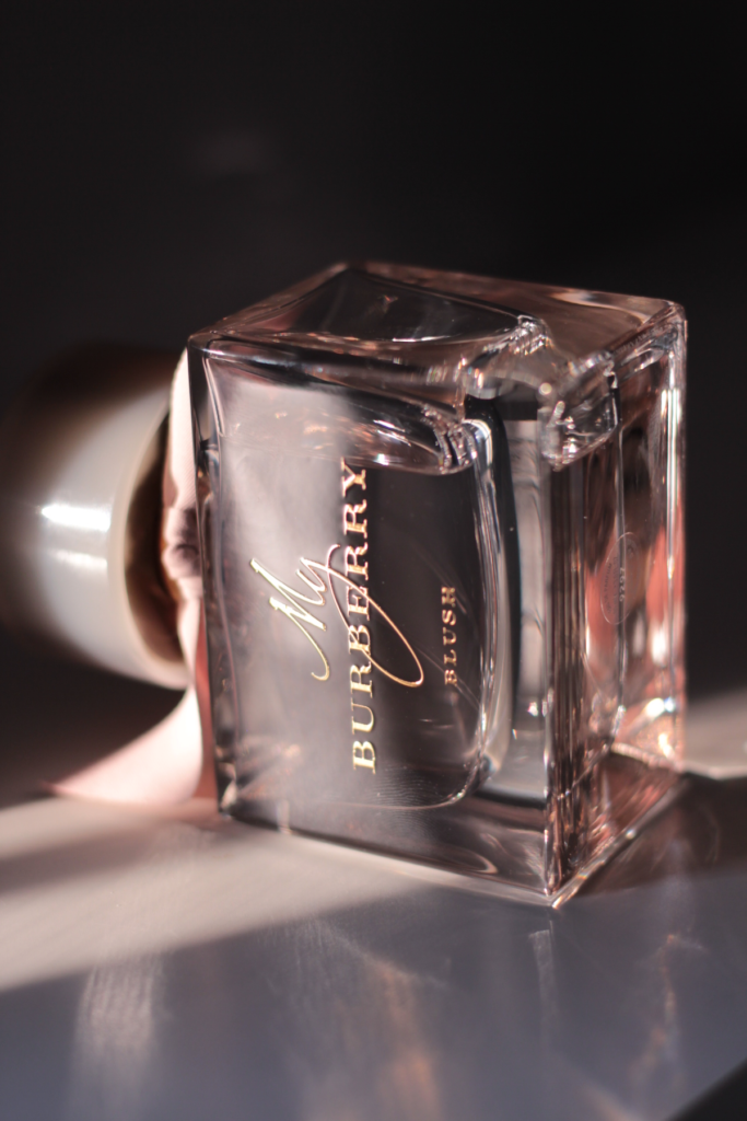
I love the slightly rosy glass, the thickness of it and especially what happens when light passes through the bottle.
The reflections become part of the design.
It can look soft, architectural, almost jewel-like depending on the angle.
There is nothing particularly outrageous about the bottle, and there doesn’t need to be.
Sometimes color, proportion and the behavior of glass in light are enough.
Perfume packaging doesn’t always need to perform interpretive dance.
Sometimes I Want the Drama
Clean design usually gets me.
But I am not joining a monastery over it.
Sometimes I want decoration, gold, reflections and something that looks like it has no intention whatsoever of being discreet.
The bottle of Estée Lauder Desert Eden is a good example.
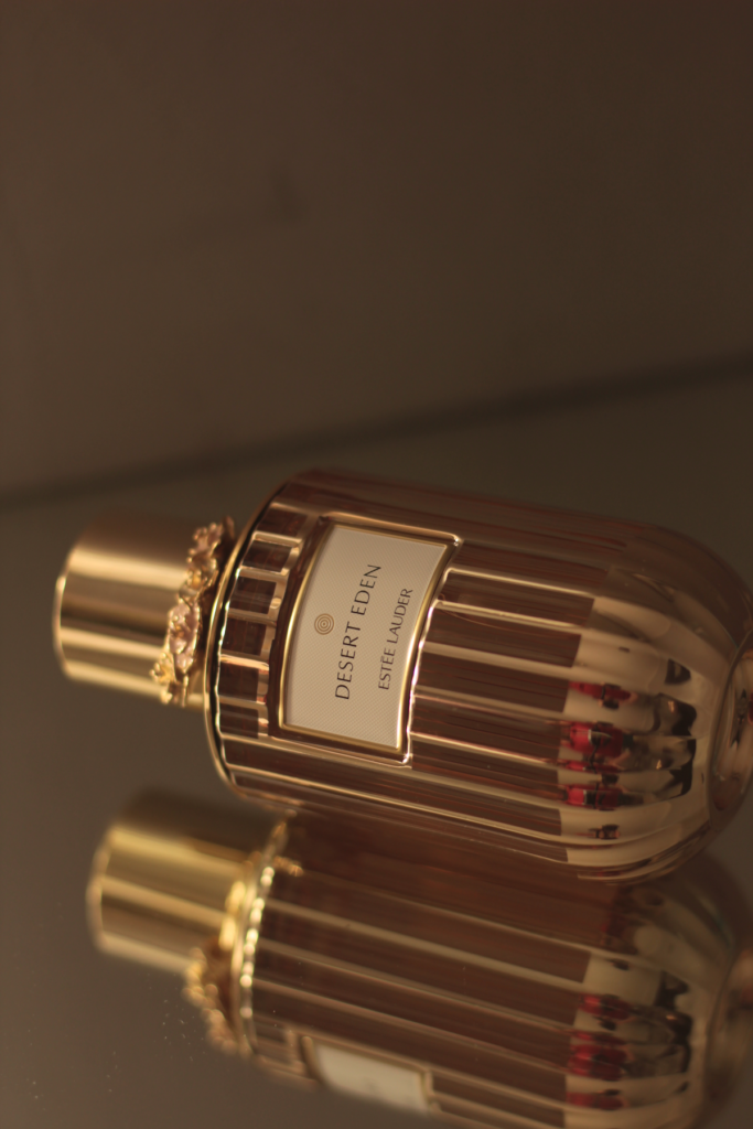
The fluted surface, metallic details and ornamental cap catch the light beautifully. It feels decorative without tipping, at least to my eye, into visual chaos.
And that distinction matters.
There is a difference between luxurious and someone found the embellishment menu and clicked Select All.
When decorative packaging is done well, I love it.
A Bottle Can Lose Me When the Fragrance Wins Me Back
Then we have Rabanne Invictus Victory Elixir.
This is where the theory gets inconvenient.
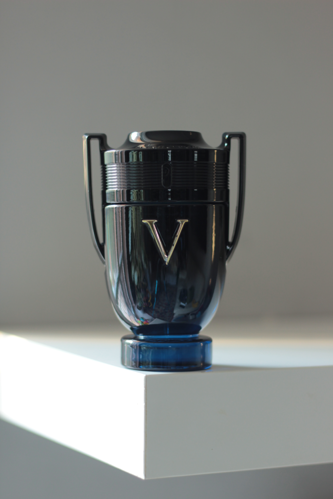
I actually like the fragrance a lot.
The bottle? Not really.
The trophy shape is instantly recognisable, completely coherent with the concept and probably one of the most identifiable perfume bottles of its era.
I understand exactly what it is trying to do.
I just don’t particularly want to look at it.
And I think that is important.
Packaging influences how I approach a fragrance, but it doesn’t get the final vote.
A bottle can make me more curious. It can make me want something before smelling it. It can also make me less interested.
But if the fragrance itself works, the bottle eventually has to sit down and accept defeat.
Invictus is proof.
And Then, There’s Chanel
Some bottles are beautiful because they are theatrical.
Others because they are minimal.
Chanel N°5 somehow feels almost outside both categories.
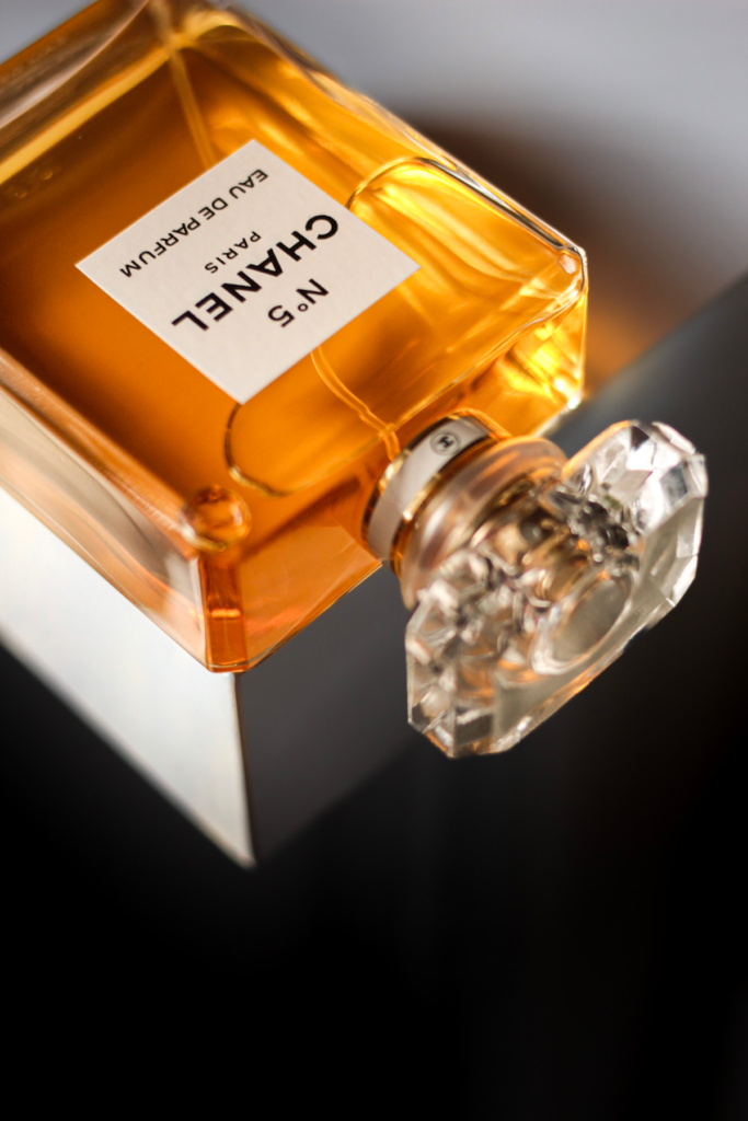
The proportions. The rectangular glass. The clear label. The faceted stopper.
Everything feels resolved.
There is nothing trying particularly hard to impress you, and almost nothing you could change without making the design worse.
For me, this is about as close as perfume packaging gets to perfection.
It doesn’t need to seduce me.
It already knows exactly what it is.
And perhaps that is ultimately what I respond to most in bottle design: identity.
Not minimalism for the sake of minimalism. Not decoration simply because luxury apparently fears empty space.
A bottle that knows what it wants to be.
The Bottle isn’t the Perfume. But it is Part of the Perfume Experience
A beautiful bottle cannot rescue a fragrance I dislike. That is why perfume bottle design is never completely separate from the fragrance experience for me.
If the perfume smells wrong on me, no amount of expensive glass is going to stage a successful intervention.
But the opposite extreme, pretending packaging is irrelevant, makes little sense to me either.
We see the bottle before we smell the perfume.
We hold it every time we use it.
It sits in our homes.
We photograph it, collect it and sometimes remember discontinued fragrances partly because of the object they came in.
So yes, sometimes the bottle sells me before the scent does.
The fragrance still has to finish the job.
But I see no reason to pretend I arrived at the perfume counter blindfolded.
| Proof that the bottle doesn’t get the final vote: Dolce & Gabbana Dolce Magnolia may not have seduced me with its bottle, but the fragrance itself did the job fast enough to become a full size almost immediately. |